Misho Baranovic

Misho Baranovic is an Australian street photographer who uses his iPhone to shoot, his pictures mostly focus on community engagement. Mishos work has been seen internationally, in places such as New York, Berlin, Italy and France. In 2012 Misho collaborated with Olly Lang (another Street Photographer) on a project called instaburb which documented Australia's suburbia through instagram. He's also wrote an eBook on how to take creative photographs through an iPhone. Misho has also featured on many TV shows in Melbourne, Australia.
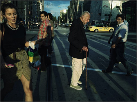
The colours really bounce off each other in this . The shadows at the back really make the photo as its so bright, the dark shadows stand out even more. Every age group is also pictured in this, although our focus point is mostly on the old man who is stood still in a busy city. I think it was also important that he took the shot on this side of the crossing because of where the sun lay. You can briefly see a light on the building to the right, because it is a darker picture the peoples clothes stand out, but I also think he's filter on this and there skin looks oily and all the same kind of colour/ texture.
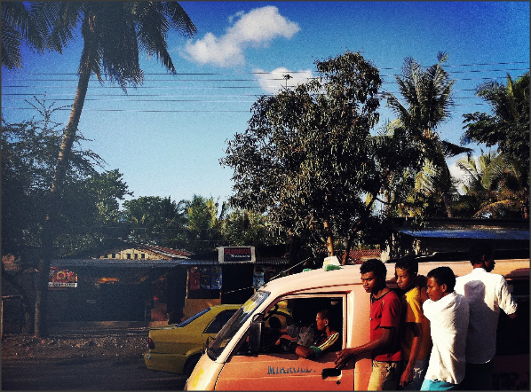
The colours in this create a incredible contrast, there is every kind of colour in this photo and it partly looks quite edited. Not only to make the colours stronger but to sharpen the picture. The ends of the trees and the peoples faces look blurry . It also looks like it fades out too as the shack at the back is not as see able as the van carrying the people. I also like this photo because it shows a different country and way of life. Misho titled this photo 'public transport'.
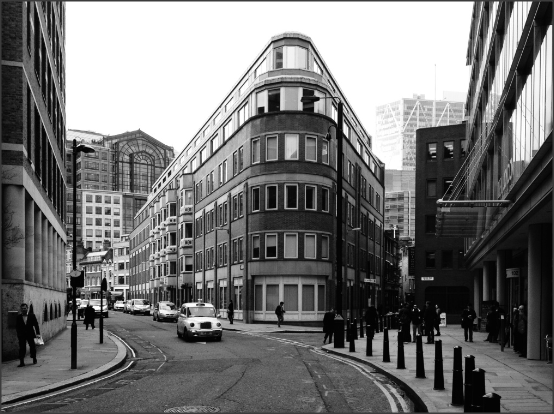
I like this photo because it really stood out, for a black and white photo its so bright. A lot of Mishos photos are in black and white and this was my favourite because of how still everything it is, I really think its special that he was able to capture such a fast motion picture so calmly. With an Iphone it must have been hard as he doesn't have shutter speed. I did actually read an article in which he says he has edited the original picture to enhance the building to make it look bolder at the front. The sides of the main building merge into the background. This stands out because it has a focus point for the eyes without having a real focus point on the phone.
Roger Clay
Roger Clay was born in California central valley in 1971. Taking pictures with his phone started as a way to simply pass time and turned in to a long life passion. His photographs mostly focus on the most unlikely items to photograph, such as rusty tractors or old bins. Roger says photography is his 'escape'. He has had in work shown in such places as Moscow, Naples, New York, Toronto and recently won the best in show at the Los Angeles Think Tank gallery's. My favourite project from Roger Clay has to be when he went to Skid Row which is one of the poorest districts in LA and photographed the most extreme and beautiful people.
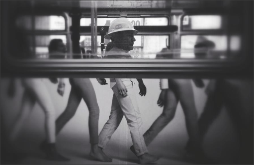
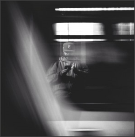
Despite the fact that this photo is genius and beautifully taken. I've noticed this chain of Roger photographing working class people . The blur around the edges is so important and I feel as though he's pulling out this individual that's lost in the mix, all of the legs on the bottom of the bus are blurred except the pair in alignment with the man. I applaud him for capturing this image as the bus could of been moving and everything is so in focus, which usually doesn't happen on a phone as there isn't a focus point. Although most of rogers photos are black and white, they're all different shades of black and white, which can easily be achieved through filters.
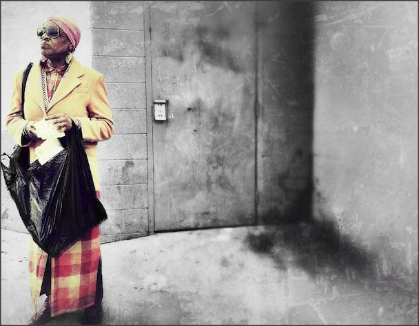
This was personally my favourite and most rare of Rogers because it actually has colour in it. The reason he used colour to me is because of this lady in general, she is probably bright and optimistic even though she's living in such awful conditions. Also at the edge it looks as though he's edited it so its like looking through a dirty window which could also connect to the fact that Skid Row is dirty and poverty stricken. The colours bounce right out at you but I also like the fact that the focus is mostly on the bin bag. I think the bin bag and the colour is most important in this picture and I really adore the way he's shown this lady through a picture. To show a person through colour on a black and white image is really immense, his editing skills are so precise and to exact detail.
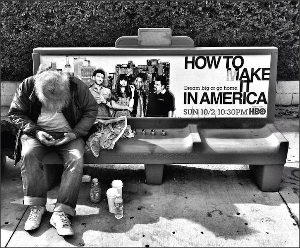
I personally think this is such a powerful photograph, because of where it is taken. I think roger showed a contrast in poor and rich, not only by taking a photograph of a old scruffy looking man who is most likely homeless considering he is in the poorest part of LA but using an app to enhance the writing on the bench. 'How to make it in America' is Rogers way of making a statement, the writing should grip you the most but the old man does. This photo would of worked in either colour or black and white, but through researching his work I've found its very rare Roger Clay actually uses colour in a photograph.
Pei Ketron

Pei Ketron is a photographer and educator based in San Francisco . Having evolved from here public school teacher background, she taught private photography lessons, she is an accomplished mobile photographer and also has over 800K instagram users following her account. Her work specialises in travel, humanitarian bases and many worldwide projects. Being so established in the industry she has various clients including, Michael Kors, Mercedes, discover Tanzania and Turkish Airways.
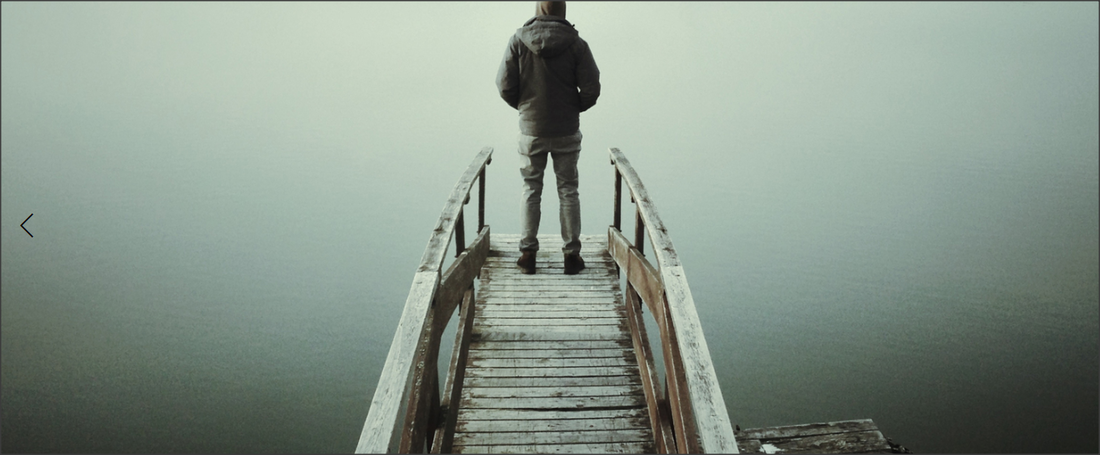
Although the picture is quite simple, the editing used to create fade as if its mist makes the picture. Personally I think it would of worked either way if the sky was clear or not. The bridge is in focus and the different worn out browns all contrast and bounce of each other ,like the way his jacket is darker than anything in the picture as it makes him stand out as the picture is quite dull. I believe with mobile photographer because you don't have a focus point/exposure, the colours mean everything and they really make the image. Its quite a sad image as its gloomy and perpetual but it stood out therefore its done the job its supposed to.
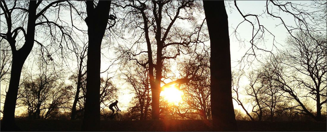
This photo looks as though its got a filter on it that's make the sky look so beautiful. To capture this on a phone must be extremely hard as if you touch the screen where you want the exposure to go down the rest of the image also darkens, so I also think she will have used an app to pull up the brightness, maybe faded out the sky a little. To catch the man riding his bike in motion would have also been tricky. It also looks like its been taking for a slight worms eye view as the trees aren't straight then are slanted. This is one of my favourites of Pei Ketron because of all of the difficult elements needed to capture the greatness of this image. It also makes me feel so warm yet so wintery, I smile when I see this photo and I think for a photograph to have this effect on somebody, its an incredible image and ticks all boxes for me.
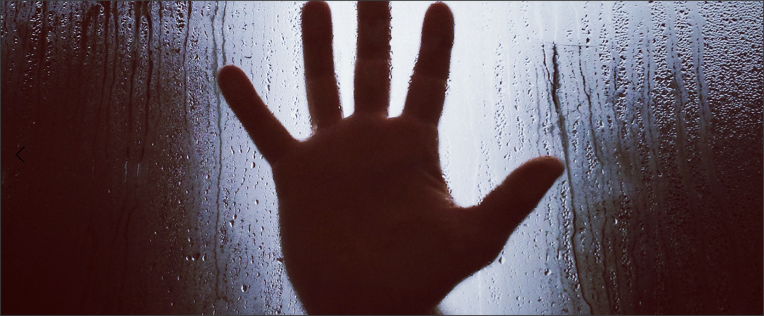
This is one of my favourite images of pei ketrons as its so simple but the steam on the window and the colours make the photo so daunting. The shadow like dark colours on the edges really make the white light shining through the holes in the hand stand out. The way she has captured the streaks where the water has fell is incredible with a phone, as even though its not in focus its one of the first things yours eyes are drawn too. I think this picture has been edited because all of the colours are picked up which usually doesn't happen with an iphone because its either one or the other on exposure terms.
|
Steve Mayes is a architectural photographer, he started his own photography business in 2002. He found a real interest in mobile photography when on trips to North America and different places in Europe but his passion for shooting buildings started when he moved to Newcastle and ended up surrounded by sensational new and old buildings. He started off working with film and mostly in a dark room. Steve says that his photography is about capturing a sense of place too initially create the real photograph which allows people to put their own view on it. 
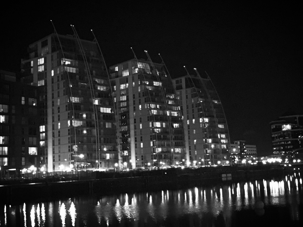
Not only do I love this photo because its so close to home and I've never even noticed these apartment buildings but the filter really makes this picture. I believe it would have been a dull day and that's why he ended up using this black and white dark effect. I love that the water still has a shine on it even though it is dull colours. Its a really simple photograph, but the editing has made it stand out to me and the way the clouds merge together.

Again another simple image, but I love the stillness and the way the blue really shines through. The only problem is you can see his reflection and his phone but I believe that taking the photo without the glass wouldn't have made it as shiny. How straight the picture is also another element that makes this image. Its very identical, clean and all in focus.
My Work In The Style
I decided to take the picture at night and from the opposite side because I didn't want it to look as though I had stood in his exact place because there's no originality there, I also really liked the lights reflecting off the water.
|
Steve Mayes

My personal favourite because its still architectural but the grey edge is so basic and simple but still manages to stand out. I think because he's so close to the window makes the reflection so similar and creates a well thought out and simply genius photograph. Also because of the way the clouds are positioned and the blue is only slightly breaking through , with a all blue sky it wouldn't be as effective because you wouldn't really notice the sky and with the contrast in colours (white and blue) It really stands out and makes the picture interesting. I also love how in focus the reflection and window edges are, its really hard to get more than one thing in focus on a phone especially outdoors where there's a lot of natural light.
|


|
Retrica is a ideal app for colours/filters, it comes along with many difference filters such as Solta , Hacker, 70 Warm etc., each one has a difference and creates a different kind of scene/ effect. The app also allows you to take photos in collages and in an incredible way, take shots of something and then your 4 shots play out in a video motion. Retrica also has a timer and allows you to video.
Pros- It posts straight to instagram. Its colours are either really warm or really cold, and there's all kinds of in-betweens, unlike other apps its has lots to choose from. Moving motion pictures, one of the only apps I've reviewed to do so. Cons- It doesn't allow you to upload your own photographs, everything that is done has to be in app and that's a problem as its quite slow as well. If something is happening quickly, it will be gone before you get onto the app. Its also slightly confusing, everything is just shaped and it takes photos by itself. |
Edges


Best Photo
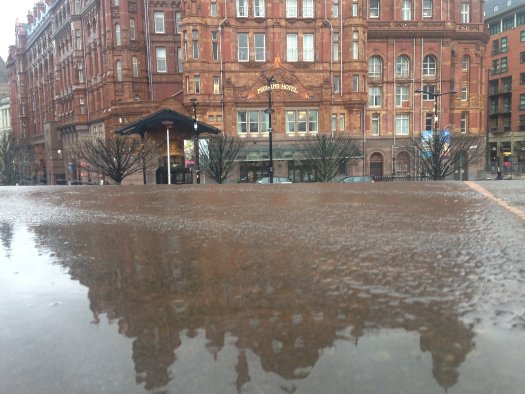
This is my favourite shot because its so different. It was a horrible day so I felt as though I needed to work with the rain. The focus point is on the reflection of the building. I really like the different textures of the stone also everything is quite symmetrical and its effective. I would have liked the building to be a little bit sharper on the edges.
Worst Photo
This is my worst photo because there's no focus point and its underexposed. The only thing I like about this is the rain on the branches because they're actually see able .


Best Photo
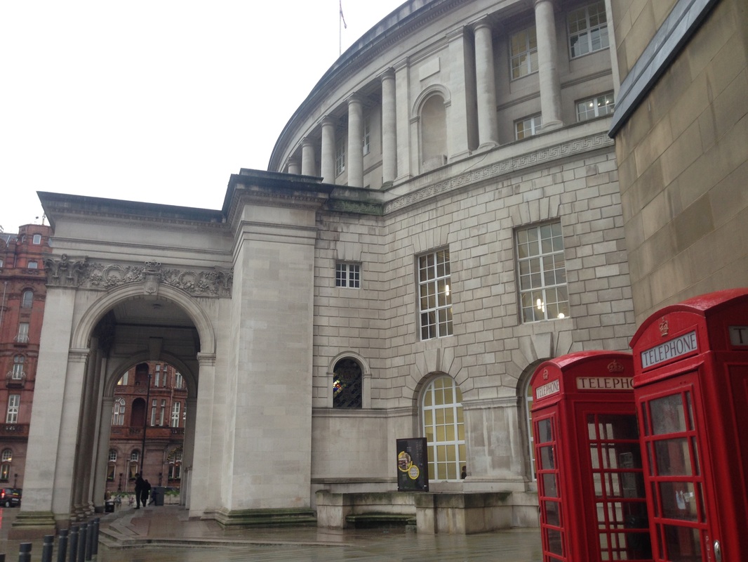
I like this because the colours bounce off eachother. This was a tricky building to photograph because of all its weird curves and unusual edges. I think this is my best photo because each edge is sharp on the building and the telephone box, yet its still quite soft. Its also very British so it stands out a lot. Even though the sky was so bright it took many shots tapping every area of the screen to try and get it to not merge in with the buildings lines.
Worst Photo
This is simply my worst photo as it has no focus point at all, Its blurry and dark. No edges were picked up so its just a mess, it doesn't draw you to it because of its features, its easily missed because it doesn't have a specific focus point.
Cathedral


Best Photo
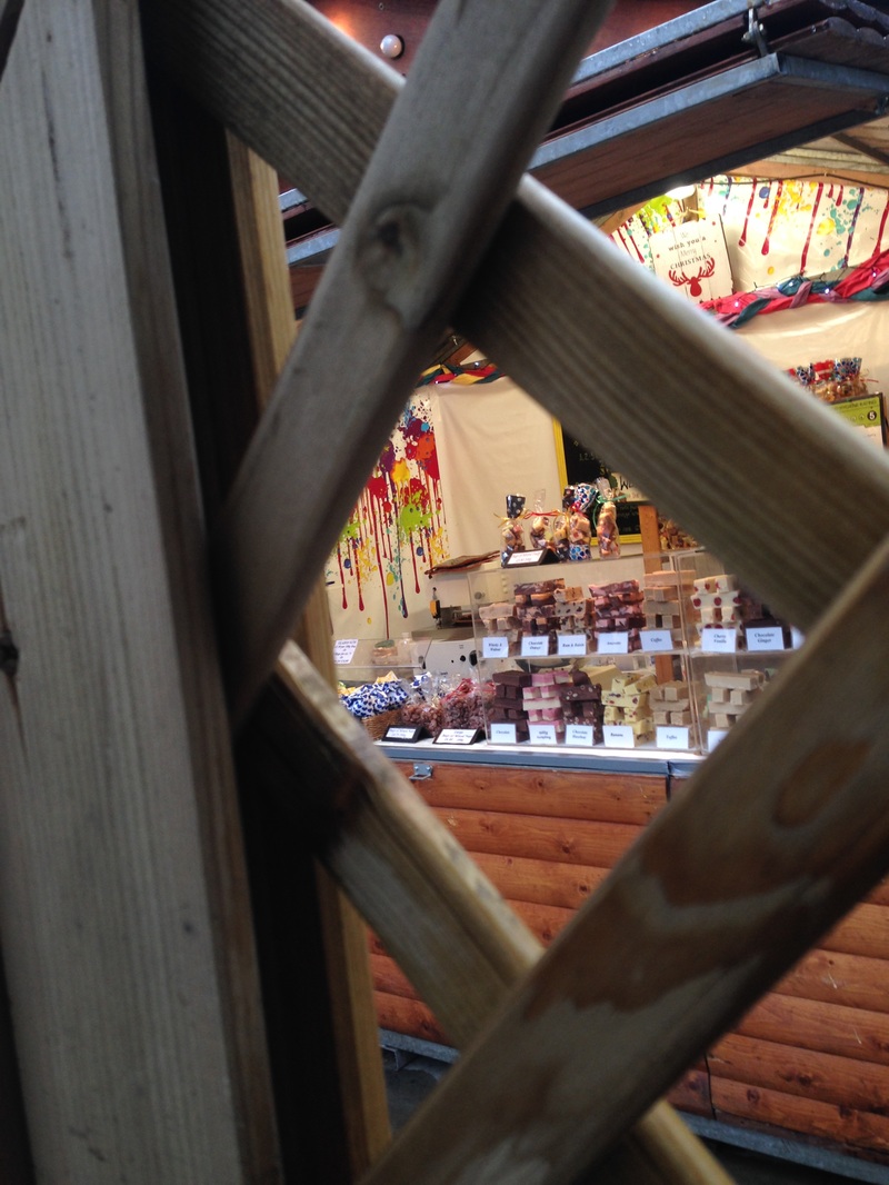
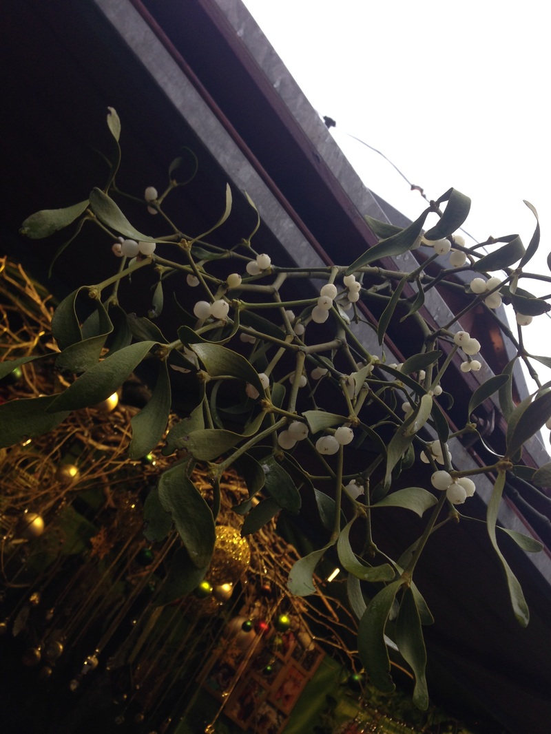
I am really attracted to this photo because of its odd angle and the way the wood strains have been picked up. The fence the focus point with the Christmas Victorian style sweet stand in the background. To create this I tapped on the stand and the other fence and other surroundings went blurry which also meant I learnt how to find depth of field on a mobile.
Worst Photo
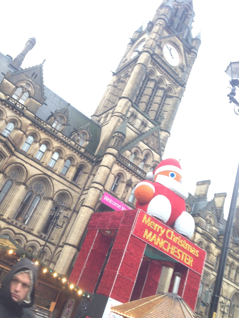
It kills the Christmas vibe because its over exposed and santas bright colours aren't standing out at all and he sort of fades into the sky because it was a bad day when the lighting wasn't correct on the photo, things tended to merge which was a slight problem. It gives me a very miserable feeling and it has no sharp nor smooth edges that could be complimented.


Best Photo
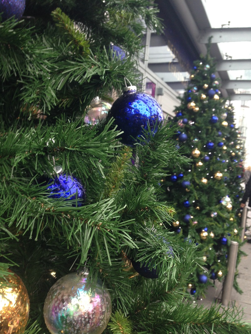
Although these photos were supposed to be based on the colour we were given this one stands out to me majorly. I like where the focus point is on the ornament, and the way it reflects the city life over Christmas. Its surrounded by green yet the blue takes over each corner. The lighting is quite dark and the outline of things is sharp.
Worst Photo
I don't like this photo as all colour was lost , Its so dull and its purpose is joy and it just looks so dull because its under exposed. The sky doesn't look snowy it just looks miserable and that feel kind of covers the entire photo. Its just dark with no real focus point and it looks sort of lost. It isn't a strong image.
