Bill Brandt
|
Bill Brandt was born in German into a wealthy family of bankers, after catching tuberculosis in Switzerland. He moved to London in 1933 and became quite the Englishman while trying to bury his roots. There he became one of the most accomplished photographers for his peculiar shots. Bill is known well for his books “The English at Home” and “London at night”. His photos focus mainly on the British class system but took a change and his focus was on nudity, he became most famous during the Second World War. Bill in our time is looked at as one of the greatest English photographer’s and given the fact that he’s not even English, I think this is quite something.
My favourite project that Bill Brandt has produced has to be “Perspective of nudes” this lines in every single picture are magnificent and his artistic angles really show individuality. |
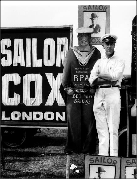
Bookmaker, Derby Day
As Bill focused of the British class system and how we lived through war times this shot is so English, from his clothing to his stance. I adore the way the sky is so white due to the filter and all of his posters have sharp lines and don't merge with the sky, the oldness of this photo shines through here and I think he couldn't get a clear shot on the mans face because of trying to keep the exposure down to capture the strong lines. I love this shot, its very English.
|

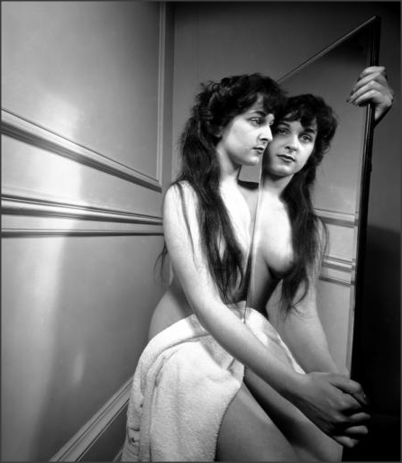
Perspective of nudes
This shot uses everything from shadows to reflection. The way he portrays nudity as a form of art is inspirational, The lines around her body are perfected so well, they're so sharp and without focus and white balance I don't know how he's done it. Lacking basic lighting equipment that we have today I think it would be really hard to shoot her shadow in her exact shape,. Its a strong image from every angle.
|
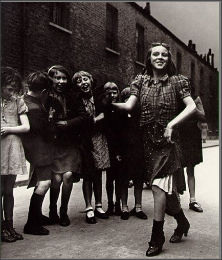
East End Girl
I really love this photo because it captures the joy of the residence and also shows slightly the contrast to today and the way technology has rid the children of the 21st centaury of this pleasure. The colour is misty and blurred, it really shows the depth of the time. Its very English with the way they're dressed , camera strength wasn't good in the war and this shows majorly but it majorly focuses on the surrounding and expressions, that is purely the work of a great photographer.
|
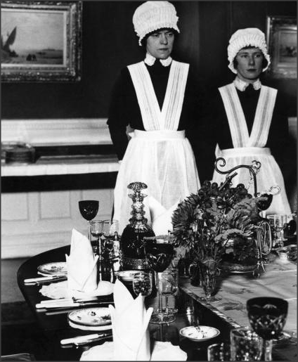
Ann Rosener

May 1943, Baltimore, Paediatrics ward
Again the scene got me because you can see the change in hospital then and today and I believe its a really cool shot to have. The cameras have really picked up the colours well even though it looks a little underexposed. Again Ann shows the elaborate hairstyles under the uniform.
|
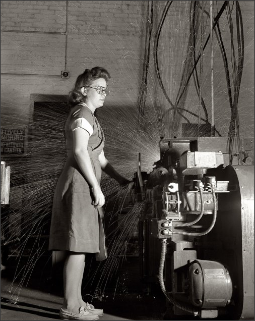
Ann Rosener was one of the members Farm Security Administration team who photographed working people during the great depression. She joined the team a little later than the others so the economy was recovering but her main focus was on women and how they were still having to work, as the men of America were away fighting the war. She became very well known for her shots of women with fabulous neat hair and pretty dresses doing 'men's work' in the factory. Its an important part of history to see how to women contributed to the war and lucky for us she was there to capture some weird sensational photographs. Her prints are currently in possession of the library of congress, but 17,000 prints from the entire team showcased a Yale University.

1943, 4pm rush-hour, Baltimore
I adore this photo because of its focus point, the black and white photo allows the expressions of each person to stand out. The blurriness and the shape of the bus allows us to explore deeper into the time and place. Its a little under exposed but it works. The industrial estates structure is dark so it doesn't clash with the sky.

1938, Fish market, Baltimore
The shadow is my favourite element of this photograph the way it casts over him like its keeping him warm, his area of rest is interesting. The focus on the location symbolises the hard times of the depression and I think its a really intriguing shot.
|
|
Kitty and Nathan were professionals and it started off just as Kitty but Nathan soon joined and 'searching for tomorrow' there website became a joint effect. They photograph their adventures and time together and invite anybody who wants to come along into their world. I really love their work because they use really unique angles using every part of the camera, such as depth of field. My favourite element of the couple is the fact they upload frequently, they breathe photography. All of their photos light, uplifting and refreshing.
|
|
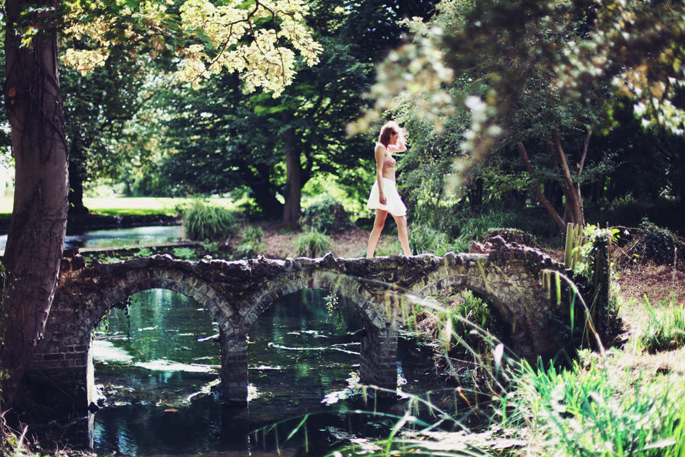
I adore this photo simply because all of the colours are picked up. The angle through the leaf is really special as it makes the photo a little different from a basic shot. The lines of the bridges are sharp and strong, also the exposure must be perfect as the water has picked up the reflection of the trees. I do feel like the model looks a little lost in all of the nature but that could be the point.

|
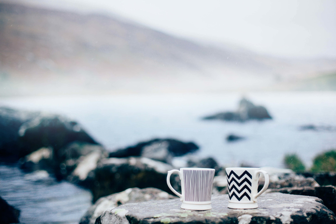
The colours, the focus on the cup, the way the rocks blur into the ocean all are perfect elements of this misty shot. It looks very cold and the lines of the cup are perfect.
|
The shadows in this shot make the image and where the light lays,
personally I don't think its the greatest location and doesn't
really tell a story. The lines of her body aren't that sharp either
but I really like the way he's captured the light.
personally I don't think its the greatest location and doesn't
really tell a story. The lines of her body aren't that sharp either
but I really like the way he's captured the light.
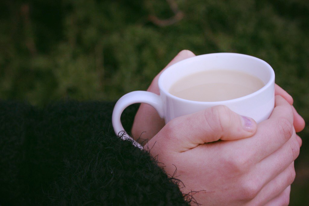
Work In the style of Kitty&Nathan
-Hands Around a mug
- Under Exposed
- Small Depth of Field.
- Under Exposed
- Small Depth of Field.
Inspiration


Best Photo
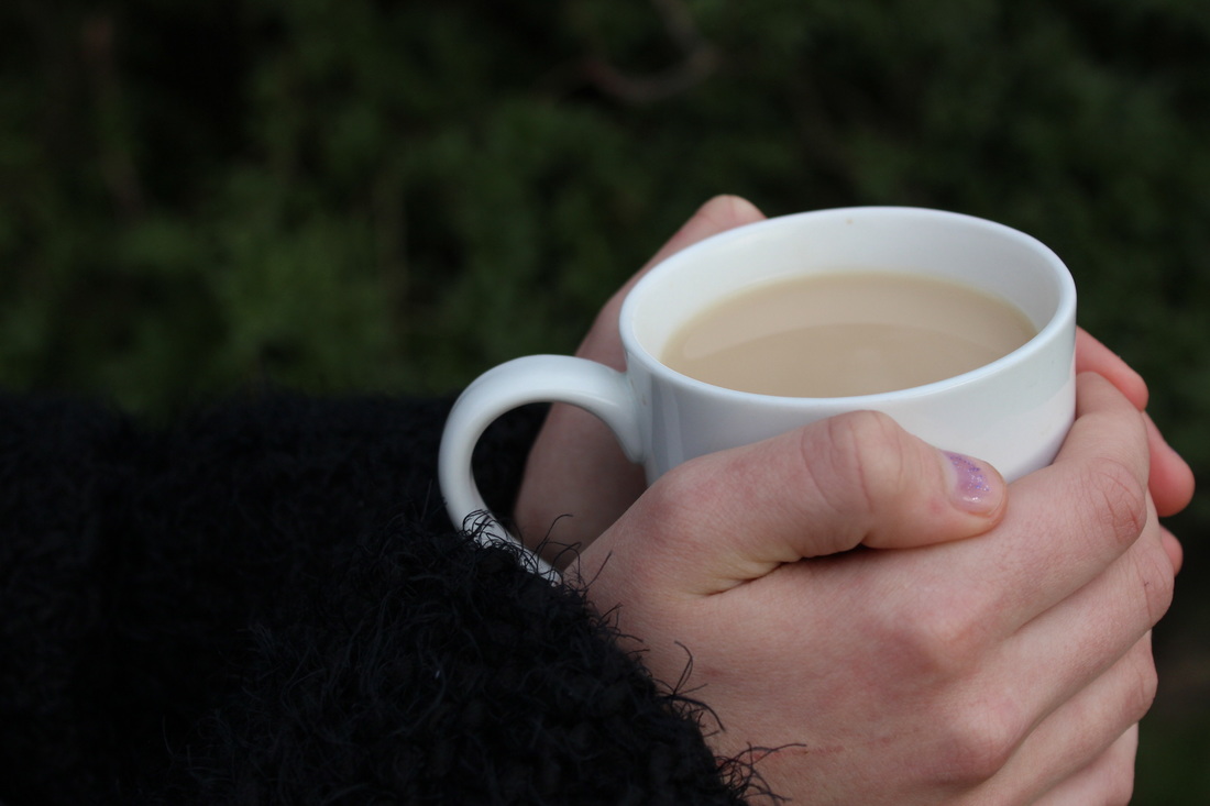
This is my favourite photo, it is a little under exposed but it works. Also in the background you can still see the nature so its getting the outdoors flare I wanted. The scarf around her hands looks quite jumper like making it not look like its in a school environment. I also like how strong the lines around her hands on the cup are.
Worst Photo

This isn't exactly a bad shot its just over exposed and that wasn't in the plan. You cant really see that the cup actually has stuff in when that's part of the story.
Kitty and Nathan used a pink warm effect for there photo, so to make mine as alike as theirs I used the app 'Image Editor' and used the sage filter.
Inspiration from Ann Rosner


Best Shot
This is my best shot because it represents the business of Anns work, its documenting a time of life and mostly a day to day routine. I like the angle and although I should of have turned my exposure down to contrast the lighting , I think it will work with the black and white filter.
Worst Shot

This is to me is my worst shot as its slightly over exposed and the focus point wasn't where I wanted to be, it isn't a strong shot.
e My Work in the style of Ann Rosener
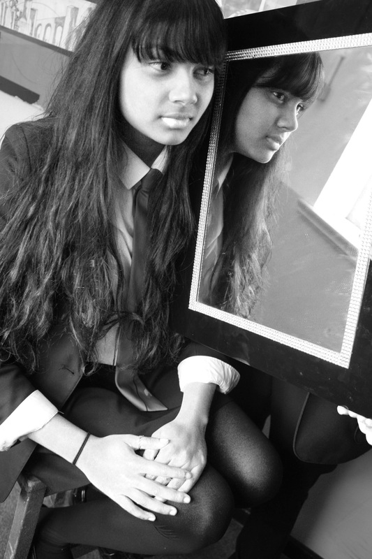
Inspiration in the style of Bill Bandt


Best Shot

I love this photo because of the angle, and the way the light comes through the window. The only thing I'd change about this picture is the focus point as its on her cheek when i would have liked it on the reflection. Its just slighting over exposed, but it works. The dept of field is on 5'6.
Worst Shot

This isn't actually a bad shot, but as were working in the style its missed the odd angles Bill would shoot from, its also quite underexposed and there is only a slight reflection. I would have upped the exposure and included a whole body shot.

My work in the style of Bill Bandt
Main objective for all shoots
In preparation for my final piece I want to document the emotions of happy and sad in a diary form, showing how life can change drastically. For each shoot I do I want to contrast both versions for example, a picture of alive flowers and a picture of dead flowers, to express the darkness. I want the break down to be inspired by Bill Bandts 'perspective of nudes' to show the emptiness creeping in.


Best Photo

|
|
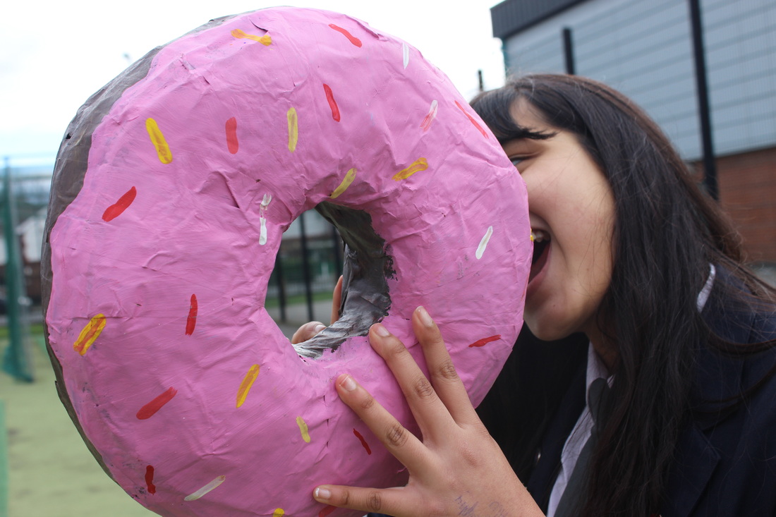
This is my favourite photo because of the angle, Its super fun and full of life. The exposure is average and the depth of field is 5'6 to capture the donut in sharp lines. I would have liked to have a better background. And picture 2 is another favourite because its different, its super focused and fun. Its just crazy so these are my best picks.
Worst Photo

The picture is miserable, it doesn't express happiness it just looks lost. Its over exposed and no camera techniques were used. Its also blurrey and out of the story context.
Shoot 1A
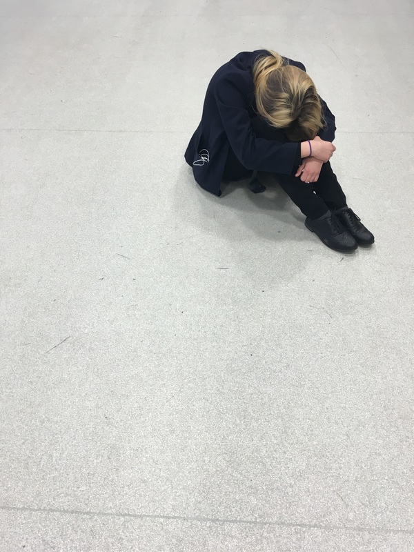
In this shoot I would like to show a model sat in the corner of a large room crying, as even though the pictures are alike in many ways, it really contrasts in the most understandable way with shoot 1, through angles and emotions.


Best Shot
Worst Shot


Shoot 2
This shoot is to represent being alone using the white landscape and cold.


Best Shot
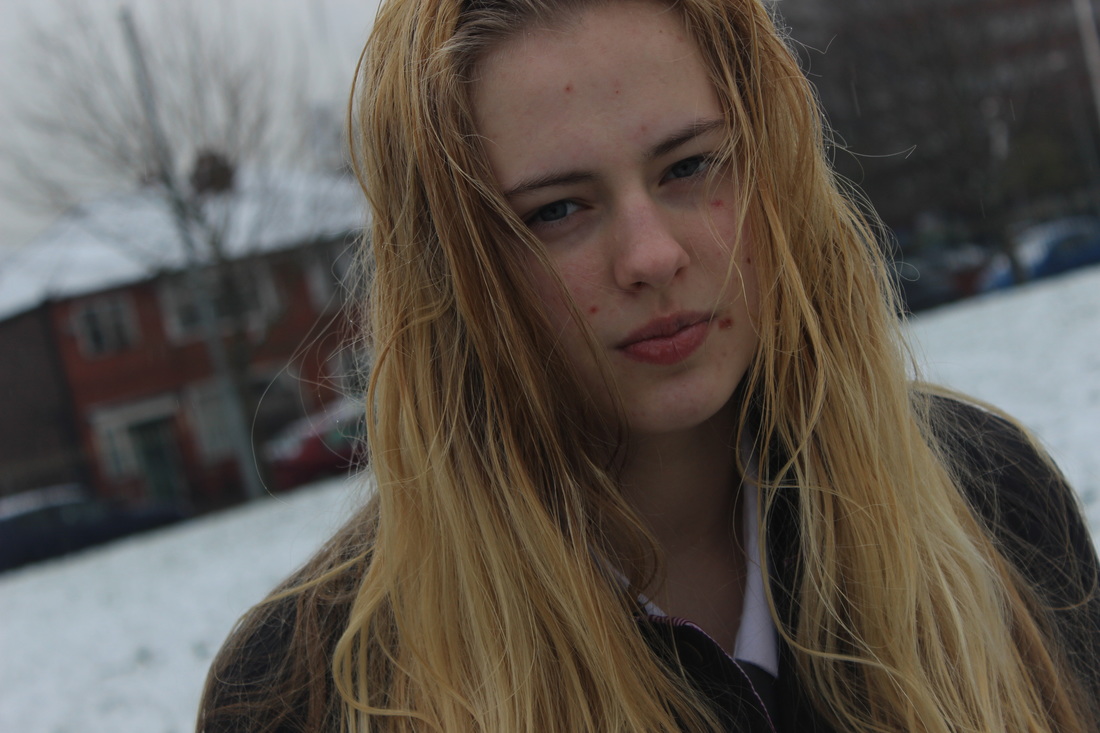
I love this shot because of the angle. Its on average exposure and depth of field 5'6. The snow in the background really contrasted with her hair and the houses so she stood out majorly. The wet hair also makes the picture look a little dark and that's what I wanted.
Worst Shot

I do like this but its out of focus and there's a bit of snow on the lens so its blurred her face slightly. Also the position in general isn't
representing sadness and she's smiling so it has no meaning. Also its underexposed and I really dislike how visible all the buildings are in the background.
representing sadness and she's smiling so it has no meaning. Also its underexposed and I really dislike how visible all the buildings are in the background.
Shoot 2A
To contrast the happier side of my work, Im using the sun as it symbolises warmth and light and a different model for emotions.


Best Shot
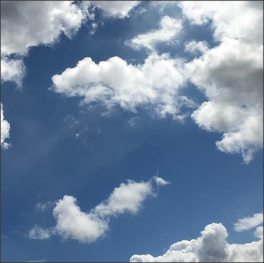
This is my best shot as its the brightest and I think the clouds contrast well rather than just having an all blue sky that looks boring. I also like the angle as it straight up and it isn't over exposed so everything is just clear and pretty. Nothing is too sharp and its quite calm and warm.
Shoot 3
As part of the happiness, this shoot is to show friendship and the planning of a trip, its there to represent energy and a positive light. I intend to edit it into a light pink filter to show a happy and warm atmosphere


Best Shot
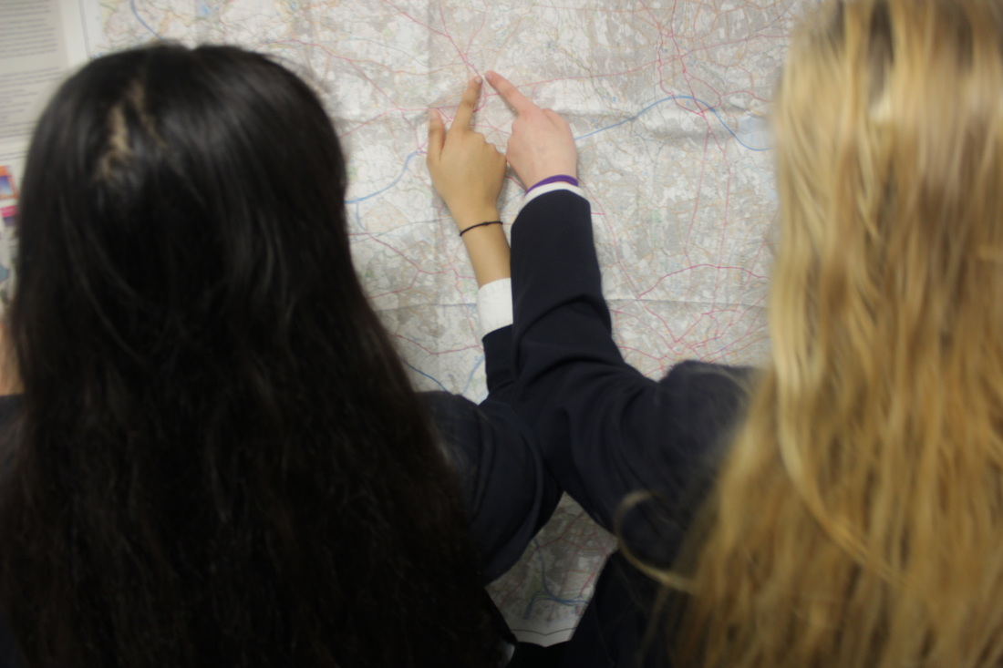
This is my best picture because I've got the light I want and the exposure is average. My focus point is on Rusha hands to show where they want to go. Also the map isn't being took over by hair either. In the exam I will crop Rusha's hair so its the same amount as Atlanta's to balance it.
Worst Shot

I do like how bright their hair looks but its over exposed and you cant tell its a map so it doesn't really have a motive. The angle is right but its to bright too see what's going on.
Shoot 3A
This shoot was done to show the loss of a best friend as depression makes you push people away, the map is not being held anymore because she's no longer looking for an adventure as she's alone. I decided to shoot in the same place to make the contrast more visible and easier to understand.


Best Photo
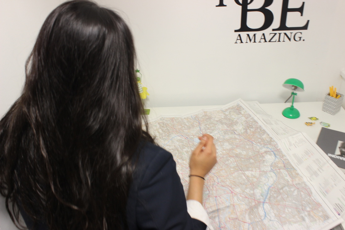
Although its not in focus it works, its blurry enough to still see the map. The focus point was on the top corner of a map and its at a depth of field of 5'6. It captures what I was looking for as it represents loss and lack of motivation. I would have positioned her differently if I was to shoot again as the light reflects off her head.
Worst Photo

This picture isn't sharp enough for me , I do like the angle as its a little different but a lot of the map is cut out. The focus point is on her head but it still looks like its blurry. Instead the focus point should have been on the map and also it isn't a nice contrast between her hair colour and the room. Its generally just a weak image and it shows no kind of contrast.
Shoot 4
Shoot 4 is a shoot where I'm not using models and focusing on how location can represent isolation and loneliness as an emotion. I decided to use a long corridor with a staircase as the drop is quite daunting and makes the corridor look longer. The corridor should represent a person feeling or being alone whether that be mentally or physically.


Reshoot
I decided to reshoot shoot 4 because I felt like the day was too dark and the light wasn't used to its full potential.


I decided to shoot this as part of sadness as it could indicate isolation and loneliness. I think long empty corridors really give a sense of misery and death. It was harder than I thought to shoot corridors because of their simplicity, finding the right angle and lighting so it doesn't merge while editing wasn't easy that's why I had to reshoot.
Shoot 4A


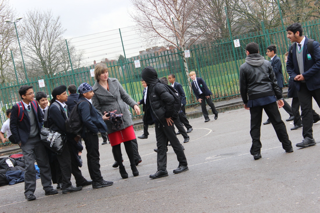
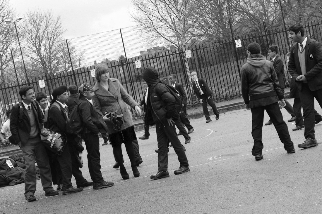
These photos are to contrast shoot 4 which was isolated , to show energy and movement. Trying to capture movement with not many children wasn't easy and also the colours around the school are very dark so they will need to be edited to ensure it looks more positive.


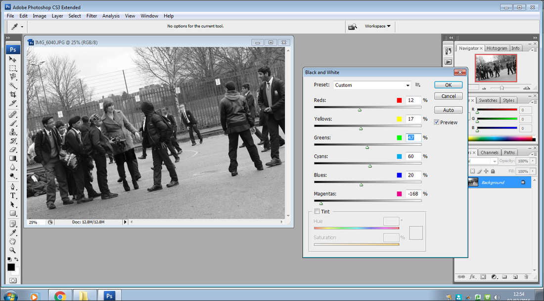
Experimenting with filters for my final exam piece so I know what filters I want to go with on the day. Black and white is quite dark and I researched what colours people associate with sadness and it was black, and with happiness warm colours like oranges and light pink.


I do like the views in this photo but it doesn't have any emotion so it doesn't relate to dairy. Its also really plain as its just a font shot with no particular angles so its quite boring. The exposure is okay as nothings being drown out by light.


Best Shot

I like this and think this is my best shot as its in focus and also its a different angle to the usual. Clearly showing an emotion though movement instead of just facial expression. The exposure is natural and the depth o field is 5'6.
Worst Shot

This picture would have been okay if my hand wasn't covering flash causing this red effect ruining the picture.


Exam Evaluation - After changing my idea for my last piece cutting time short, I took my pictures again all featuring people of different ages to show different generations. For my final piece I wanted to have a open diary hanging, with different pictures falling out. I used day 1 of my exam editing my pictures and doing cello tape transfers so that diary pages were visible behind my photos, these went horribly wrong so I had to start again on the second day. Not only did I start over on the second day but I also had to thread my book and make sure it hung well, with all of the pictures sticking in different directions.


