Campaign photography is a ad campaign which uses powerful photographs to send a message to its viewer. It is mostly used to raise awareness for a certain topic.
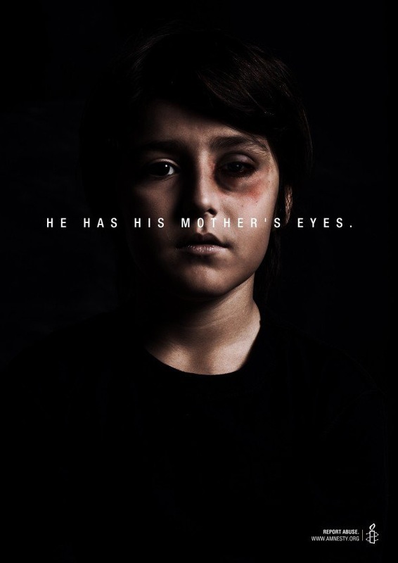
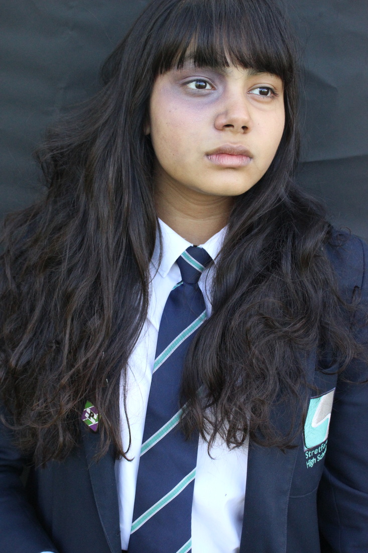
This is one of my favourite photos not only because of the light and the way only his face stands out, but because of the shock factor it causes. You look at this picture and it makes you sad, you read the text and it makes your heart crumble. The spotlight is shined on his face only on one side implying the light was coming from an angle. I do believe the text makes the photo but all in all, the text and the way the photo was taken bounces of each other. This photo explains that not only is his mother being beaten but he is too and the "He has his mothers eyes" represents, his mother has a black eye too. They both need saving. The shadows around his face make the picture sadder and more effective. It is powerful because of the light and how theres a balance between extremely dark and that small glimmer of light that hits the right side of his face. The child being in the black t shirt makes the photo more effective because it merges into the background so all the focus is on his face and the bruise. I like that they put the organisation on the bottom in white and not a different colour like the other campaigns. This keeps the tension engulfed in the picture.
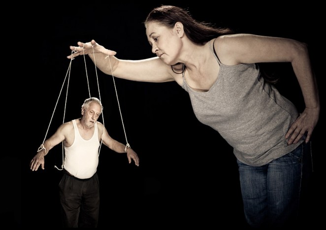
A lot of the domestic violence campaigns have dark backgrounds and the people have the light covering them. To me this story shows a strong over powering women taking advantage of a weak, vulnerable older man. We see a lot of stories about elderly carers abusing their patient physically and mentally. This woman is using the old man as a puppet while he's ill. Photoshop has been used to create the puppet affect. I also think their body language is important, the middle aged woman looks smug and is stood bent over doing the controlling and the old man looks on his death bed, struggling to stand up and hold himself. He also looks like his mind has gone and he's dead behind the eyes. Putting the old man in a white vest makes him stand out on the black background. The grey makes her look emotionless, cold hearted and dull.
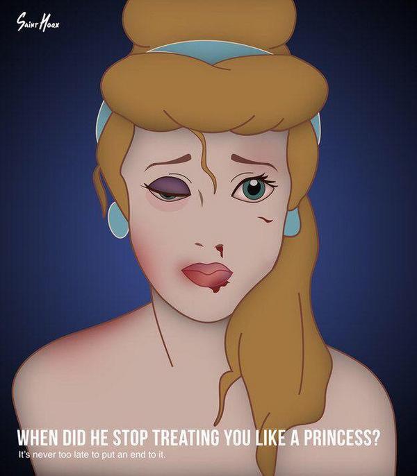
I choose this photo because it isn't dull and black like the others. Its uses colours but they not full, even though they are rather bright there is still a dull affect in them, the shadows on the sides create a dark yet colourful picture. I love this because the photographer has made us see that domestic violence can really happen to anybody and we'd have no clue about it because it happens behind close doors. The princess's we wanted to be when we were younger with the fairytale and the most handsome princes aren't so happy and defiantly not living the fairytale. I also like that he has stripped the princess's down to their bare body. The message "When did he stop treating you like a princess" means that at the start of every relationship they treat each other like the world and they care the most for each other, when that stops you shouldn't be with them.
Even though its a cartoon and some people would say its not as effective as real people abusing each other, I believe it is because it takes you back to your childhood and just imagine if cinderella was beaten up by prince charming in the book/film. You'd be mortified and it shows that even the people you think it will happen to less it does. So never look past somebody just because on the outside it all seems magical.
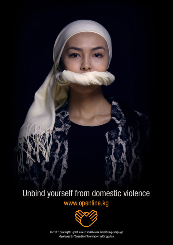
Most of these pictures have black backgrounds, so that the light can shine on the person who is being photographed. I like this photo because it uses her religion accessories to create what's going on. It looks like her scarf wrapping carries on going round to cover her mouth. Indicating she has to keep silence about what's going on behind closed doors. I like the way the light sits on her eyes, although they still look dead which alternatively makes the picture more effective. To me the photos effectiveness dips when they put the yellow on top of the black, it takes away the tension, I believe it should be white like the rest of the text if you have to put the organisation on the campaign.
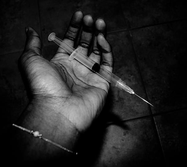
For my final campaign research I choose to do anti drug as its another situation that has been over looked. As words like "cocaine" and "LSD" become more normal and nitrous oxide is used by teenagers on a daily basis being inhaled by balloons, I think its time to stop this and let children live to be an adult. I personally feel like this picture is so dark it's sort of shadowed out the whole message. If I was to remake this I would continue to use a dark background, maybe put a little bit of a spotlight on the hand and needle and put a sepia effect on. I would also have some text as the message could be lost to certain people.
WHY?
I chose to base my campaign on domestic violence because it is still happening so much within our society and I feel as though its being overlooked and forgotten. It is still happening, if not more than ever. Domestic violence is common in all cultures, religions and ethnic backgrounds. 2million injuries and 1,400 deaths are caused each year as a result. I bet you didn't know that 1 in 5 girls have been assaulted by their boyfriends. Approximately 40% of our young people are being subjected relationship abuse in their teenage years. Domestic violence reminds me of Voldemort in Harry Potter, nobody dares to speak about it and it is stuck in a shadow. Another reason why I want to do this kind of campaign is because I believe if it is seen around more and isn't classed as something that's the victims fault then more people may come out about it and find the justice and closure they deserve, hopefully everybody will be able to speak more openly about it in the future.
Plan
i want to create an image to symbolise domestic violence. My model will have a bruise around her eye, i will add text to help put my message across using photoshop. these are the things i will need for my shoot...
Dark area/ Dark background - school toilet/ inspiration room . It needs to be dark to give the feel of isolation.
Iphone Flash light to create a spotlight. The light has to be shining on her face to make her stand out also to help with the focus point of the image we are trying to capture.
Girl for my model
Make up bruising . To help make the picture more real.
Camera settings
- The camera will be set on F.5.6 because i want a close shot of the girls face and everything else out of focus.
-Exposure just under normal to help make the picture darker.
-Focus point will be on her face because this is where the impact of the abuse has happened.
The process
First shoot


|
|
|
|

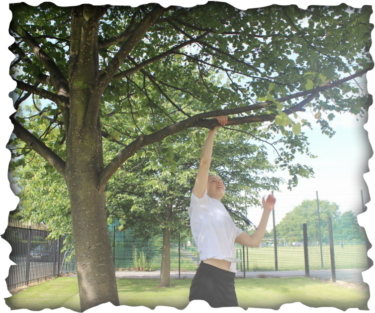
Personally I think this is my worst shot because nothing is in focus, its over exposed and all in all looks like a bad photo, there is also a shadow of light glimmering across her head which completely ruins the atmosphere of the dark and sad picture. This happened through reflection and in the future we would just use a blank page to stop the light reaching anything other than her face. I do like the fact that the school is in flection though as it could stand for anything and show that violence is happening everywhere. If it was in focus it probably would of been one of my best pictures simply because of the reflection and how you could add a story to it. The reflection on her head also makes her look like she has a bald patch and that isn't okay.
Best picture

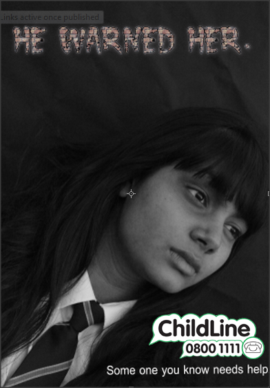
I think this is my best picture not only because all the focus points are right and the bruise stands out, but because this is the effect I was going for, I turned the exposure down as the sunlight on that day made the photo look jolly and happy when we were trying to create a dark scene. I also like the way her hair merges with the back and we also left space on the top for the text we're going to add later on using photo shop, the only problem with the top is it is quite bright and doesn't really match her face so we would have to find a blank picture on Google and replace it over this image to make it darker. I also like the angle at took this photo at, it slightly looks up at her face giving space at the top. All of my other photos have been a centre shot so its nice to try something different.
I really like this photo because of the way the light sits on her face, the black eye is in focus to support the main objective. But the only problem is the light, for the kind of object we are photographing for its far to light and sort of looks more like a headshot as its shot from her stomach up. Its a really cute picture but it isn't powerful enough for domestic violence. The focus point was in the middle as I wanted the everything in frame.
Things I would of done differently :
- I would of took her tie and her blazer off because it takes the effectiveness away, even though she could be in a high school relationship being abused as its different.
-I would of straightened out the black paper we used at the back because it looks likes a curtain and looks stupid.
- I would of took a couple of shots with her hair up to see if it made a difference to the bruise.
- Used darker makeup to make the shadow coming from the bruise more visible.
Editing

Testing different fonts for my text on photo shop.
Deciding what kind of text to use, using cool text.

Putting a black and white effect on the picture made it sad. I sort of lost the black eye with the effect but I like the shadow on her eye. I used the brick wall because its different and it stands for something hard and bold, suggesting that someone around the person reading it may be going through this makes it more effective because it leads you to think about the entire situation a lot more and the more personal the campaign is the better. If I was a passer by and I saw this I wouldn't think it was powerful. I think I'm going to put it back in normal colour because the bruise makes the picture.
Shoot 2


Most of these pictures are really bad for the simple reason that the whole point of the picture was not visible on all but one. Being outside made the phone screen harder to capture because of reflection. These picture's were to represent bullying and how people can hide behind a phone to hurt somebody else, bullies can also be found in relationships. They don't just have to be hurting them physically but mentally too. It was really hard to capture the photo I wanted because of the light, ideally it should of been done inside. The exposure took over the picture in a light and dark way.
Best photo
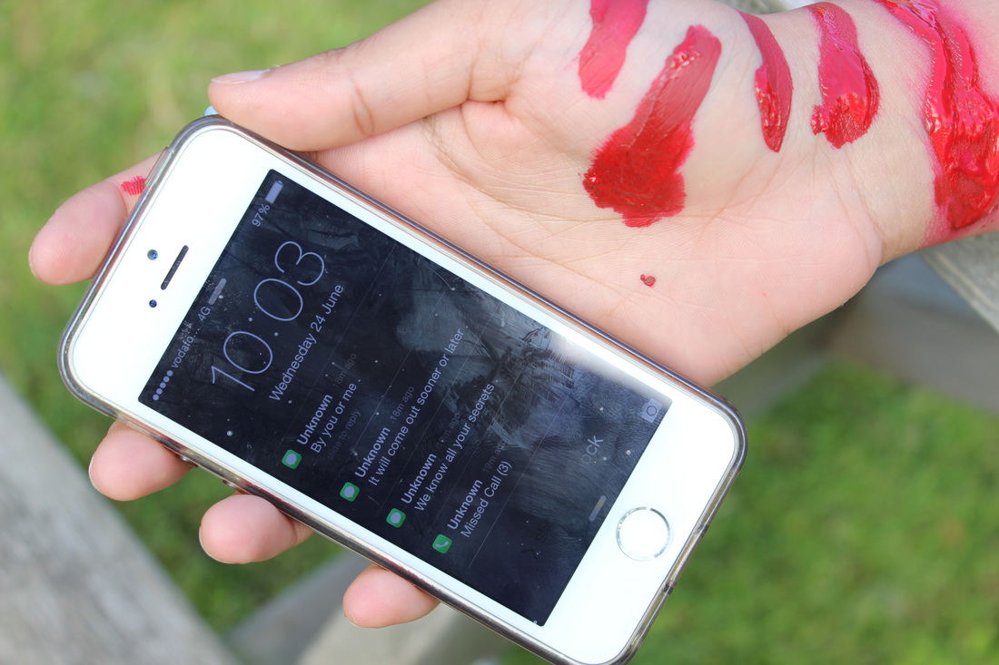
Even though you would expect the picture to not be as bright because its a dark subject. The brightness really works and not only makes the cuts standout but also the phone. The focus point was on the screen so that the messages were the main subject in the picture. Everything else in the picture is blurry as I thought it was pointless having it in the photo when its right in front of your eyes what the main message is. This is the only picture the messages are clear on. It's a little bit over exposed and the white balance is on day time. We used blood (paint) to make the photo more effective and show an outcome of bullying in any form, which was Self Harm. I could of took the picture from far away and shown Rusha lay on the table but I feel as though that would of also lost the point of what the messages said. My main focus was on the cuts and the phone. I like the small reflection of the trees at the edge of the phone because it creates the scenery and shows were we were. I like the fact that there is no buildings in the picture either to show that this was done in secret. We put the finger marks over the phone screen to show that she has been threating over the messages and wondering whether to open them and respond or not. I wouldn't add any text to this. Maybe just a child line logo as the messages and the cuts speak for themselves and I believe text would ruin the picture, take away the effect of it all and possibly drown out the brighter colours in the background, I feel although the message would be lost if I added text . I also like the way the grass is slightly visible in the spaces of the bench. If you was to look at it closely I think you'd be able to see that her arm is hanging off the bench. This photo could be used for both domestic abuse and cyber bullying and I think that is what makes it special to me, being abused on social media links to near enough everything and most written abuse is given out on them sites. j
Things I would of done differently :
- I would of done the shoot indoors to prevent reflections.
- I would of took extra time on the cuts to make them more realistic.
- I would of done it on concrete as grass is a bright green colour and that makes people happy.
Things I would of done differently :
- I would of done the shoot indoors to prevent reflections.
- I would of took extra time on the cuts to make them more realistic.
- I would of done it on concrete as grass is a bright green colour and that makes people happy.
Retrying the Shoot
As you can see trying to shoot this outside was a terrible idea because it was a bright sunny day and everything was reflecting. So we took it to the brighter bathrooms and getting the phones messages in focus was a lot easier. But none of the shots were correct, there was a flaw in every single one of them, if it wasn't the phone being out of focus, it was Rushas bruise being unable to see. I would have to say trying to create this affect was the hardest out of anything I've done. We decided to change the blood as it looked so artificial, and meant that the picture lost the power and intenseness that it had, the bruise is supposed to symbolise a hand mark, to suggest bullying.


shoot 3
The process
NO HANDS WERE HURT DURING THIS PHOTO SHOOT !!!


I tried to create a suicide scene where Alanta is hanging from the tree and its just her legs dangling. I was happy with what day it was as the photos title is 'its not just a bad day'. The blue sky and everything glimmering around her suggests its quite a jolly day and im going to use photo shop to make her body into a black shadow. I'm going to keep one picture the same and one in a black and white effect to show a contrast. I'm not entirely sure I like these photos, it hasn't kept me engaged me like the others so I'm going to do another shoot and choose the best one.
Shoot 4 Plan
SMALL HANDS, TAKE A PICTURE OF TWO PEOPLE FIGHTING.
. IT WONT MATTER WHATS IN FOCUS AS THEY WILL BE FUSED TOGETHER ON PHOTOSHOP.
. SHOOT HANDS AT F 5.6
. SHOOT FIGHT AT F 16
. EXPOSURE NEEDS TO BE BELOW AVERAGE ON THE HANDS SO THERE IS AN OUTLINE AND THEY STAND OUT
.EXPOSURE AT AVERAGE FOR FIGHT
Best Shot
I like this photo because of the angle. Alanta isn't actually in the shot but you see her in the reflection through the mirror and I really think its a good shot. This photo was one of the only ones that actually worked simply because of facial expressions, the models couldn't hack actually looking like they were bullying somebody so I had to capture it when they were joking around. The focus point is on Rushas hair because before that it was on her hand which was on the mirror and it worked being there. Even though the photo is bright the exposure was below average, it doesn't really matter as the photo is going to be in black and white and partly covered.
Worst Shot

This is my worst photo because other than the facial expressions being totally out of context, there isn't a focus point and there is nothing sad about this photo. It doesn't show the overall objective which was somebody being bullied. From everything to the water not being as in the shot I wanted to the brightness of a sad scene. This picture just didn't work and that's why its my worst shot.

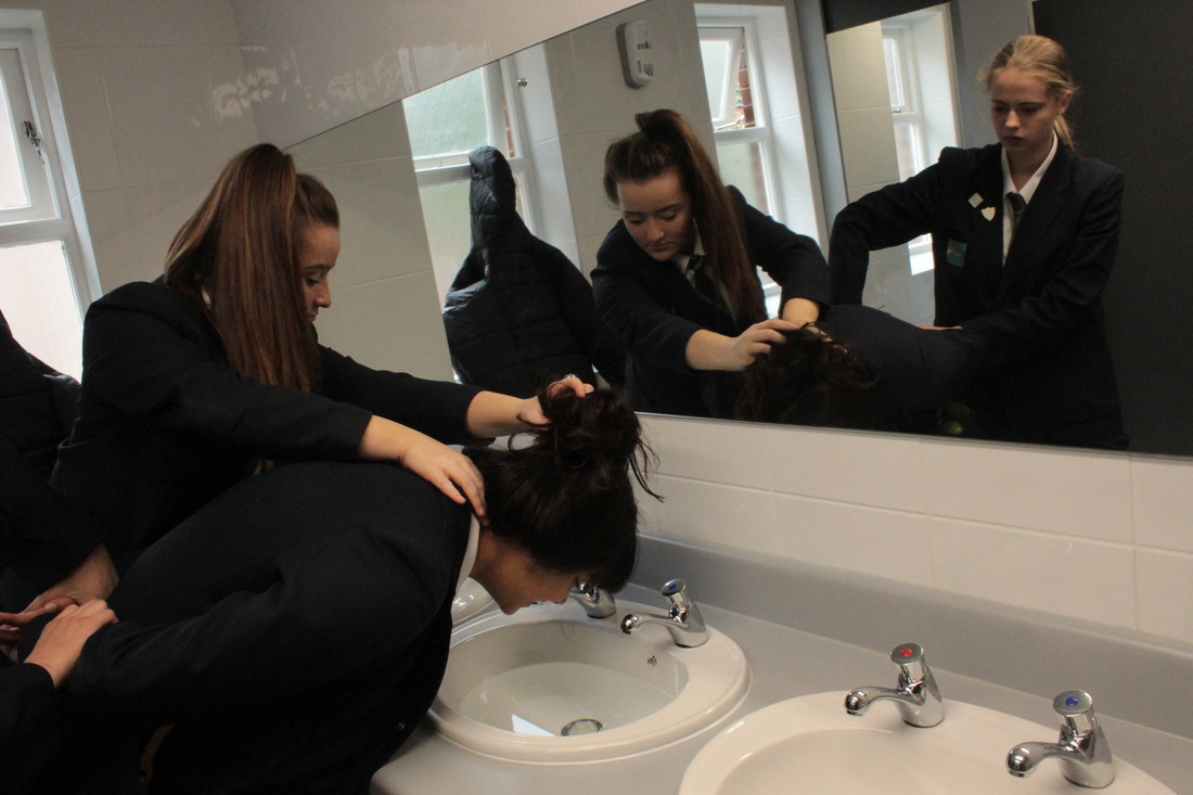
The hands represent a guard. Through the guard you see why shes in hiding and what she endures on a day to day basis. Sort of like behind closed doors but instead the doors are the hands. Through the lies and endless excuses, the baseline is she is being bullied everyday. Its in black and white because any subject that is sad, should be dark and gloomy. I took this approach with the hands because its different from most anti bullying campaign photographs which are quite basic and just show the abuse. I like that both bullies are show how in the light and the victim is dark, bottling it all up inside. A child would cover their face when they don't want to see something anymore, like the victim they are trying to wash their brain of the constant abuse. Through facial expressions it looks as though Atlanta doesn't really want to be doing that but Jade is really into it, they were the perfect actors.
Things I would of done differently -
-Used a darker area.
-Removed the coat of the window.
- Had Rusha's face as the focus point
Plan for Shoot 4 -
-Ask two people if I can use their feet.
-Lie them down next to each other
-Find a white sheet
-Put it over them both
-Add tags to both of their feet, with their names and how they died
-Put photo in Black and White.
-Focus point on one of the tags
-Low shadowy exposure.
-Ask two people if I can use their feet.
-Lie them down next to each other
-Find a white sheet
-Put it over them both
-Add tags to both of their feet, with their names and how they died
-Put photo in Black and White.
-Focus point on one of the tags
-Low shadowy exposure.
Next I want to use my own house as a location. I want to do this because your home is a very personal place, I will use my phone to take the photos and use the Iphones blur in my favour as I want the photo to be blurred and not understandable. I want to use a strong and bold text that will stand out. I want my parents to be the two bodies and lie on the floor.
I have tried to edge away from just the normal domestic violence , which involves a man hitting a woman and tried to show what it can result in (eg self harm and suicide). I took this approach to try something different and make links instead of sticking to the original stereotype of domestic violence which results in the man eventually killing the woman.


These photographs were taken with an IPhone 5. Most of the effects with no effects on don't look realistic so its hard to feel as though that's a powerful picture . Using the Mono and Noir filter that is built onto the IPhone it really helped set the dark and gloomy tone. On an IPhones camera wherever you tap on the screen it either goes extremely bright or to dark, setting the lighting was tricky as in was in my living room. There is a small focus point which the phone picks up whenever you tap but the rest is down to the filters. I choose to do this story line because most of the pictures I researched were women with bruises, this idea shows both sides that either way you wont win. That is why he had committed suicide because he killed her and couldn't live with it. To choose the feet was a wacky option because most people only use faces. I used the feet to show the difference in size to help show which was a man and which was a woman, the same with the mans feet being closer to the camera to show that that body was longer.
Things I would of done differently
-I would of lay my parents on the kitchen floor (which is white) to make it look freaky and asylum like.
-The shadowy light in some of them that glares on top of the floor, it should have been turned off.
-The shadowy light in some of them that glares on top of the floor, it should have been turned off.
BEST PICTURE
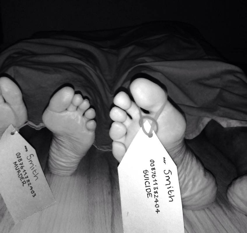
I like this picture because of its monotone effect, its so gloomy and dull but the tags stand out as they are in as much focus as possible. I used the Snapchat app for this photograph as it blurs most of the background out when you tap where you want to be in focus. Everything in the background being blurry really helped with the scene, nothing really looks death like in a living room and trying to find a backdrop for a powerful picture was hard. It was kind of over exposed where the white sheet was but it really gave emphasis to the bodies and it is another element which made up the storyline of this photograph. His tag being in focus a lot more than hers showed the different side to the story which is consequence and that was the whole goal of this shoot! So I am really happy with the way this photograph has turned out.
WORST PHOTO

I don't like this photograph because these feet don't look dead. The image is all wrong, the light is so bright creating the centre room lighting effect. Although the tags are visible and you can clearly read what they say, they are not creating the harrowing effect which is what I was striving for. There isn't a focus point and the sheet looks so irrelevant to the story. Everything looks to alive and light, therefore I don't like it and I think this is my worst photo.
Step by Step


